
Windows Search
Overview
Windows Search is a critical feature of the operating system, used by nearly a billion daily active users. Given it's crucial nature, most work that happens on search is scrutinized heavily, going through multiple release cycles before making it to production.
During my time on the Windows design team, I worked on core search functions like natural language parsing, semantic search and optimizations to address latency.
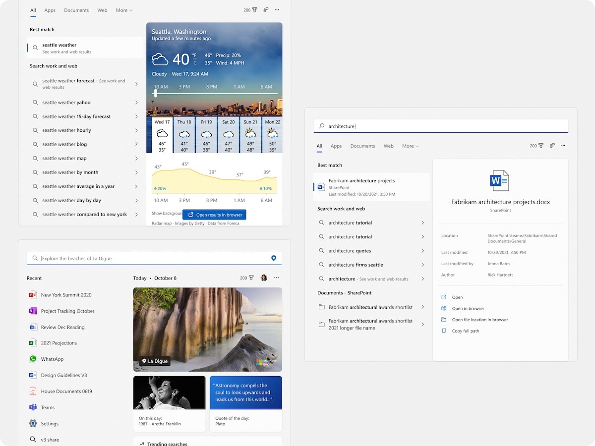
Different variants of the search box depending on the type of query
I also worked on the monetization vertical within Windows Search, primarily focused on the content browsing experience powered by Bing. I helped design experiments to increase engagement and track growth.
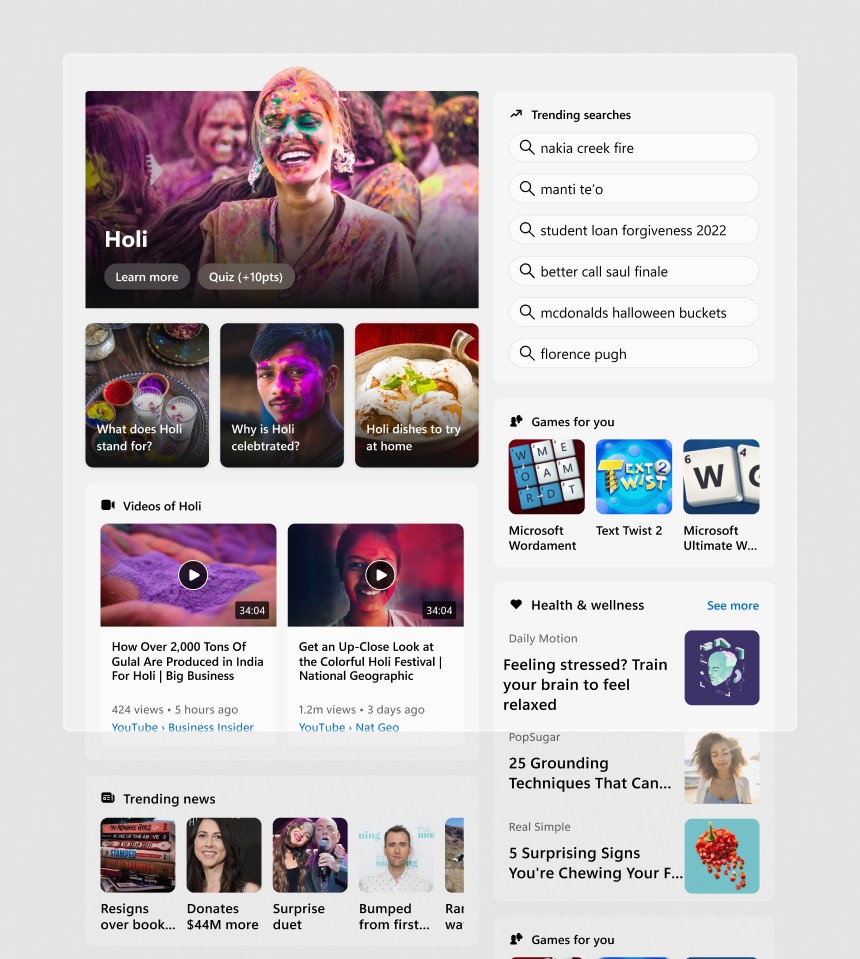
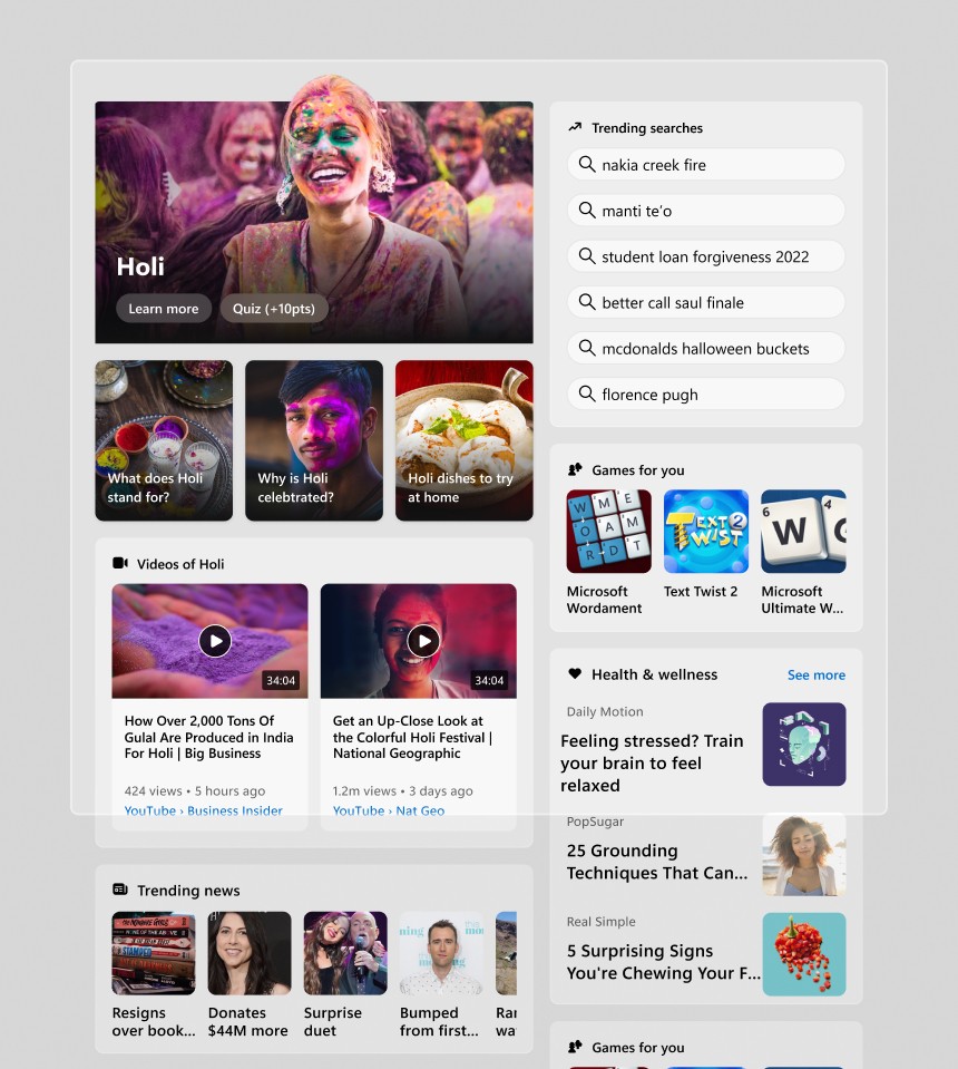
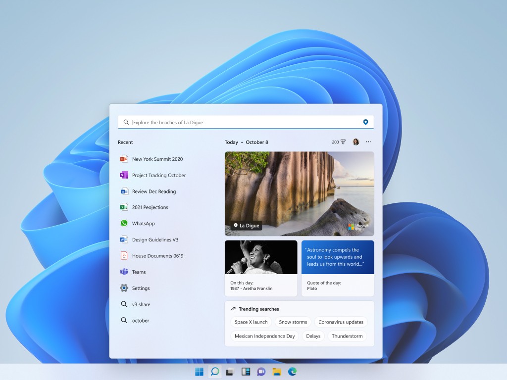
The content browsing experience refreshed everyday similar to the Google Doodle
Another role that I carried out involved helping partners integrate their services into the search box. I worked with them through their process and educate them on the best practices before eventually reviewing their proposed designs.
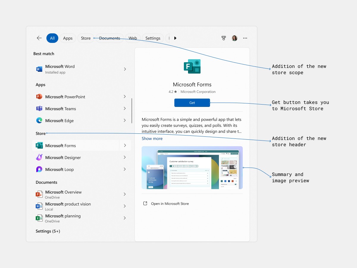
Different elements to help integrate Microsoft Store apps within the search box
Finally, one of my larger efforts involved incorporating motion design into the search box, as I was the only designer with the required skill. Apart from establishing the motion guidelines, I focused on improving overall UX by adding animations with the intent to make the search experience better. The following is one such case study:
Case study:
Creating a loading indicator
This motion design project taught me the complexities of shipping at scale, working with legacy code and arriving at a solution from an idea all the way to handing off code.
Problem
Windows Search integrates various providers or data indexes such as local applications, locally indexed files, cloud storage files, web results etc. When a user searches, the engine attempts to find matches across all these providers and give a result. Now these providers have differing speeds, which results in certain providers (like applications, web results..) to be shown more than others because they come in quicker.
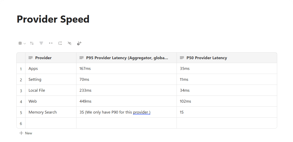
Provider speeds were in the milliseconds range, which in practice is very hard for customers to decipher
Process
Initial exploration
I began by investigating the constraints of the search box, utilizing existing research materials and specifications provided by my PM. This gave me a clear understanding of what an initial attempt at a loader might be, looking at some commonly used paradigms.
My first idea was the shimmer effect, an animating placeholder that helps create an illusion of loading
Different variants of the shimmer I tried using speed and scale
My PM partner had asked if we could show to the user which provider was being searched at a given point in time. I considered using progressive disclosure of information to clearly indicate this without overwhelming the user.
This idea begins by displaying all the different providers, then drops down to show content as they finish loading.
At this point, I realized that search returned results in the milliseconds range, which suggests most of these animations that I shared above would be too fast to notice. The human eye generally requires about a second to register movement.
This concept accurately reflects the speed at while search returned results. You easily miss the loader at the bottom left corner and there is a noticeable stutter while loading.
Simplifying the approach
I dropped the idea of showing text and realized we needed something that was clearly visible in the millisecond range. The progress bar came to mind, as it is widely recognized by users and conveys a sense of loading without the need for text.
First version of the progress bar, common and effectively visible at higher load times
We preferred displaying the progress bar at the top edge because of the customer's attention went to Best Match usually. Now, I was looking at implementation details such as when to trigger the animation, how it would behave while a user is typing.
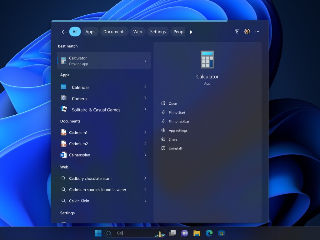
The progress bar is triggered only when the user completes typing "C-A-L" at the bottom left. A blue dot on the left of the file name also indicates which file loaded last.
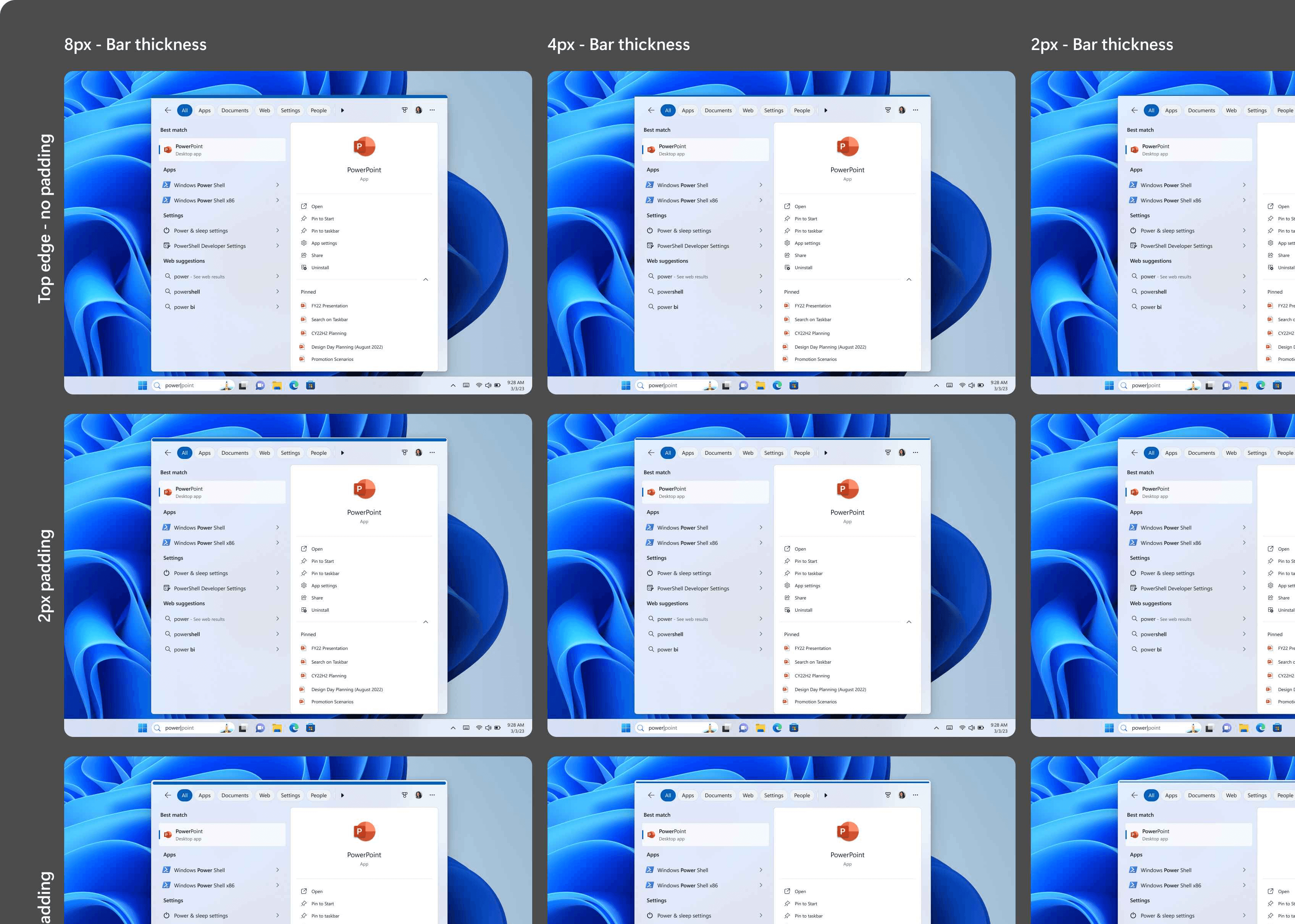
Multiple variants of the progress bar, experimenting with different thicknesses and padding from the edges
Solution
We had multiple reviews with our stakeholders and decided on the most subtle implementation keeping in line with the Windows 11 design principles. The final solution incorporated a few more tweaks and changes to the motion parameters to ensure it was both effective and non-intrusive.
Final Design: A refined top edge progress indicator that is subtle yet effective.
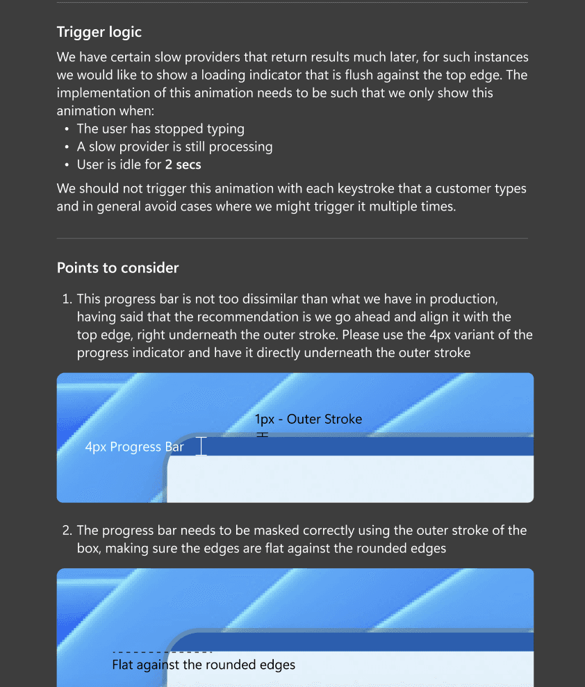
Implementation Details: Specific parameters on when and how long the loader should be displayed.
The next step was to implement the design in code and fine-tune the timing to ensure it was smooth. I dedicated extra time to this task, looking at existing references and tried out different parameters to ensure that the animation ran smooth. I have shared the result below that can be viewed on codepen.
Learnings
This project reinforced the importance of subtle design solutions, even for large-scale problems. Working on this taught me invaluable lessons about cross-functional collaboration with product partners, design system leaders, and engineering teams, as well as the complexities involved with large-scale design implementation.