
Carter's Mobile App
Overview
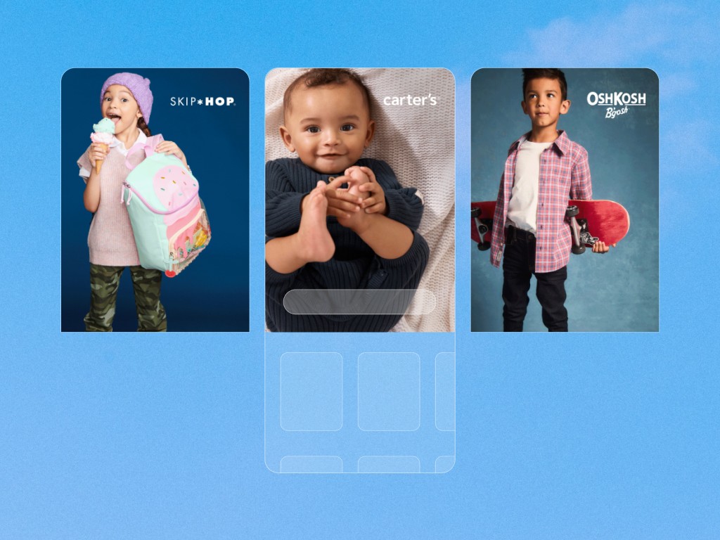
Carter’s, a leading name in children’s apparel, recruited me directly from SCAD as part of their founding UX design team. Since the organization was new to product design, I played a key role in establishing design processes, conducting research studies, and even running workshops with leadership.
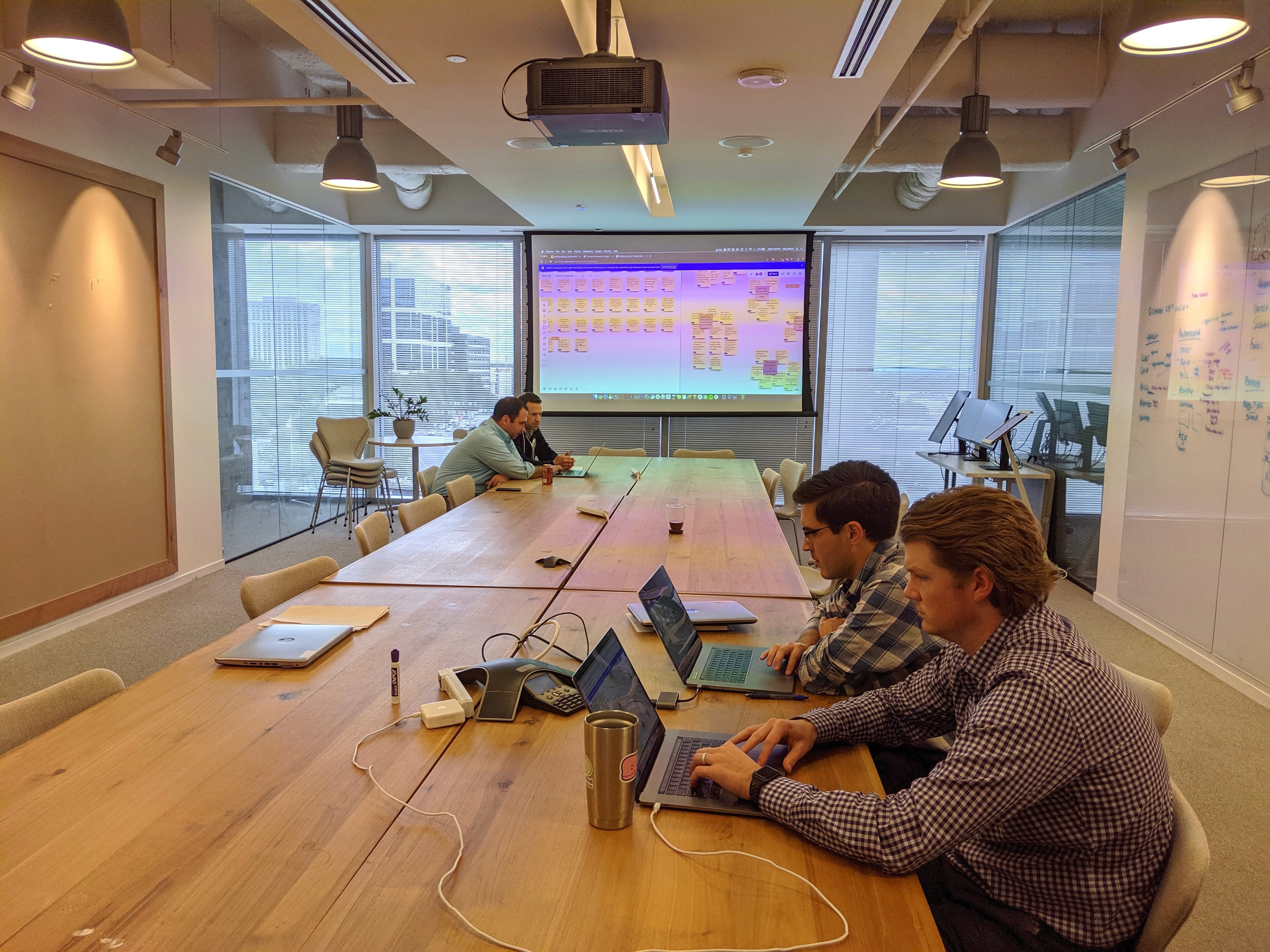
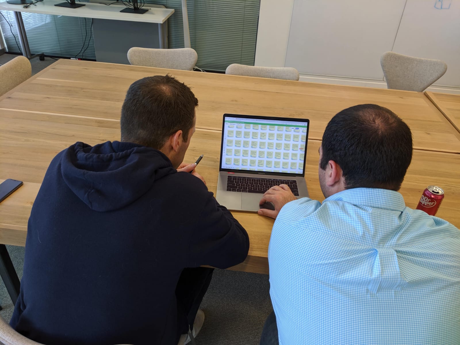
Images from an affinitization session I conducted with our leadership
The larger part of my stint in Carter's was focussed on their native mobile app. I was the sole designer and redesigned the entire app—everything from home all the way to checkout.
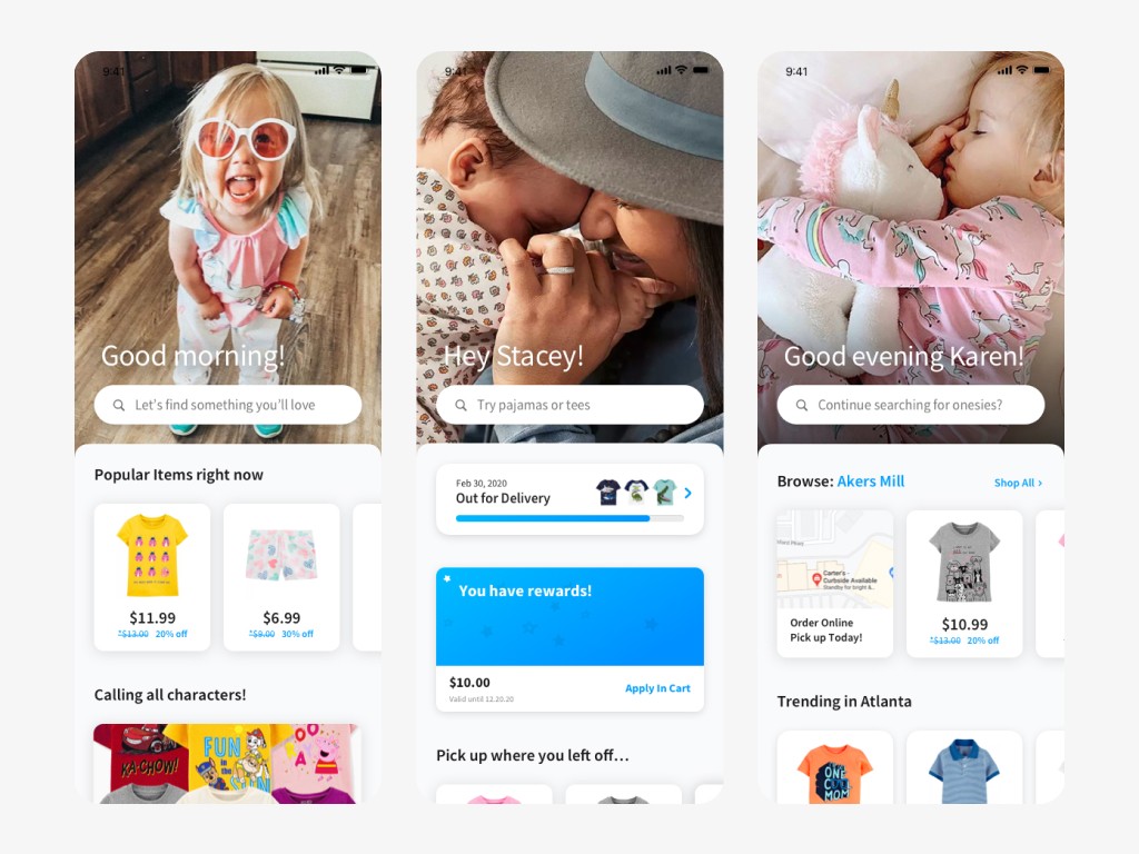
Home page is dynamic for differing levels of authentication
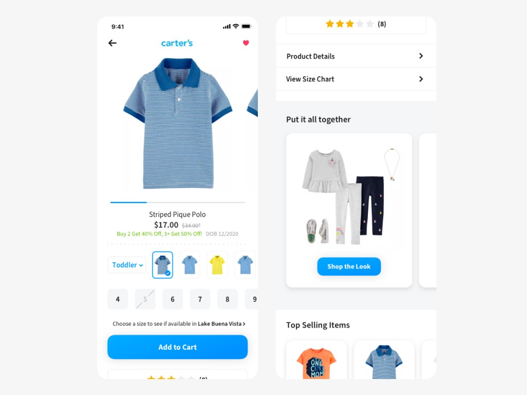
Product detail page involved some unique pieces of meta-data
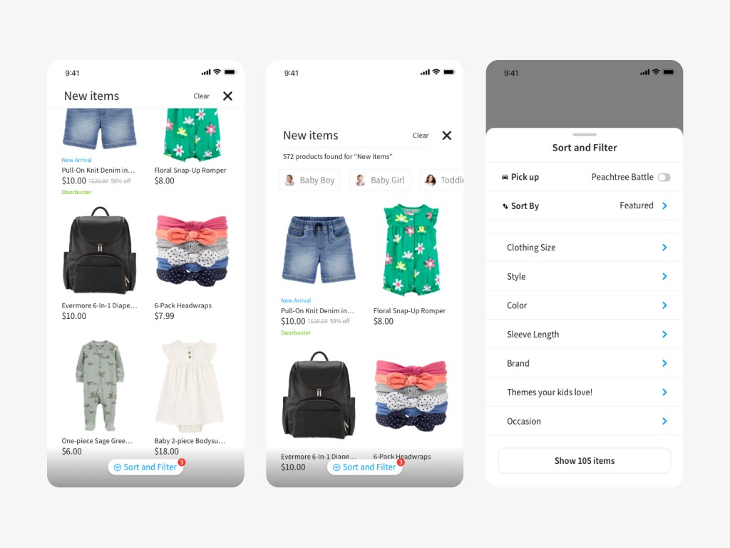
Some screens from the search experience
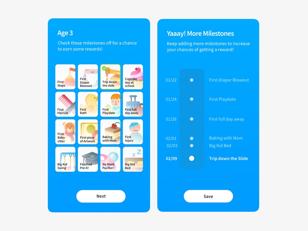
Gamifying the experience: Keep track of your babies' milestones and eventually earn rewards
The entire project was nearly ten months of work even being affected by the pandemic. Each page and flow could be its own case study, but one of the more interesting stories is how I went about re-designing cart and checkout which is presented below.
Case study:
Improving cart + checkout
This project operated in a space of ambiguity with high stakes, as improving cart functionality and checkout success would directly impact business.
Problem
The original Carter's mobile app was a web view version of their desktop website. This setup caused numerous issues resulting in a poor user experience specifically when it came to the bottom of the funnel. Some of them are listed below:
Complexity: Customers found the cart and checkout process cumbersome, with pages that were lengthy and complicated.
Inefficiency: The lack of a mobile-first design approach hindered smooth navigation, often confusing users about the sequence of actions.
Technical issues: We would encounter frequent problems like missing image assets and even failed orders resulting from the third-party setup.
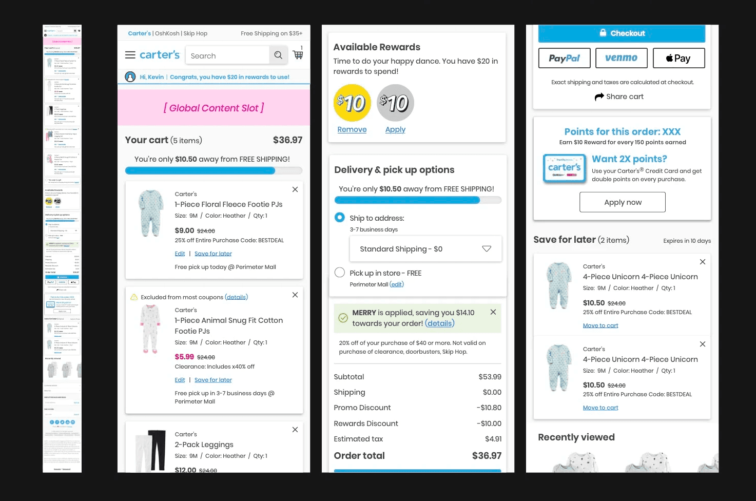
Older cart screen from the web view app
Details about some of the issues in the product tile in cart
Goal
To streamline the cart and checkout experience by reducing friction, simplifying the user journey, ensuring key details are easy to find and guide customers naturally through the process. Ultimately, leading to higher conversion rates and customer satisfaction.
Process
Research
To start, I conducted twelve hour-long interviews with moms at different stages of parenting. Since our largest segment of sales was baby-toddler (0-3 years), a fair amount of the participants were millennial moms. The study focused on:
• Understanding the motivations and challenges of raising children.
• Evaluating app-specific habits/tendencies to better understand baseline expectations
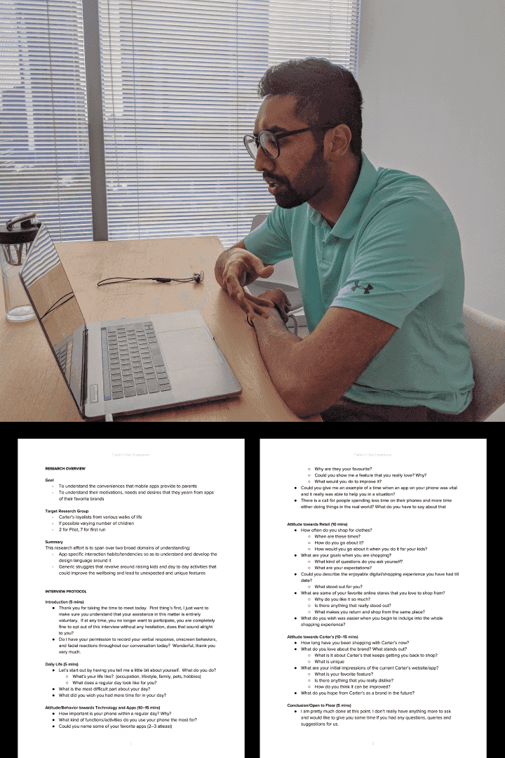
Research Process - Conducting the interviews along with the interview protocol I had created
I gained a lot of insights from the study, with some key takeaways are highlighted below:
Convenience is key
Moms are often juggling multiple tasks, squeezing shopping between errands or maybe nap time. They need a checkout that’s quick, hassle-free.
Trust and Clarity matter
Moms rely on clear product information like sizing, reviews, and honest descriptions to make confident decisions.
Initial exploration
The existing cart gave me a good starting point. I used that, along with additional learnings from the research study, to come up with my first design exploration.
Some learnings from the research study
• Pictures were the most important point of reference for our customers
• Customers are well versed with swipe based interactions, gestures are encouraged
• Concise messaging was crucial—less is more.
First attempt at re-designing the cart, incorporating some swipe gestures to delete
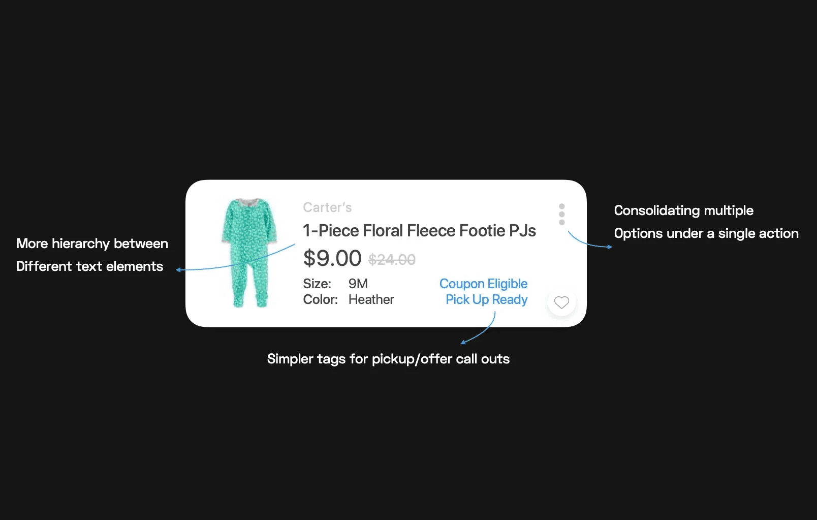
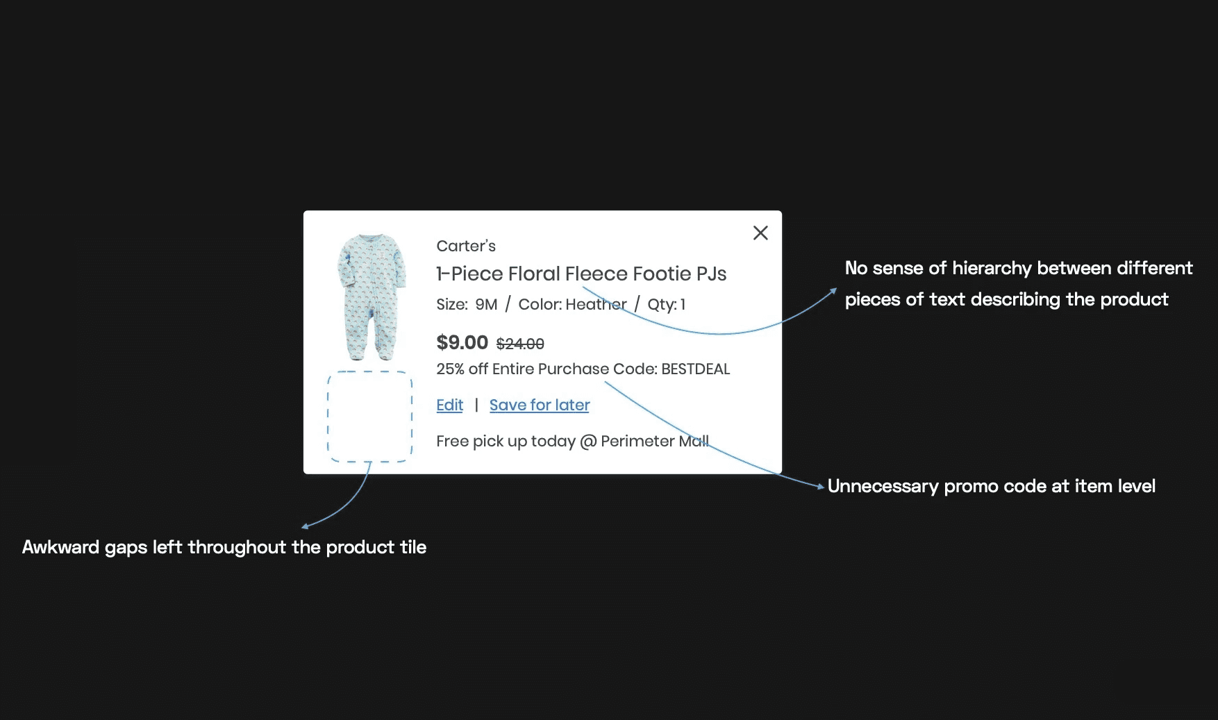
A deeper dive into how I addressed some of the issues in the product tile
Design system integration
We had a quick review, and the overall concept was well received. Since some of my newer ideas needed more time, the direction was to stick with the existing cart layout and focus on the design lift. This is when I decided to apply the design system I had been developing in parallel.
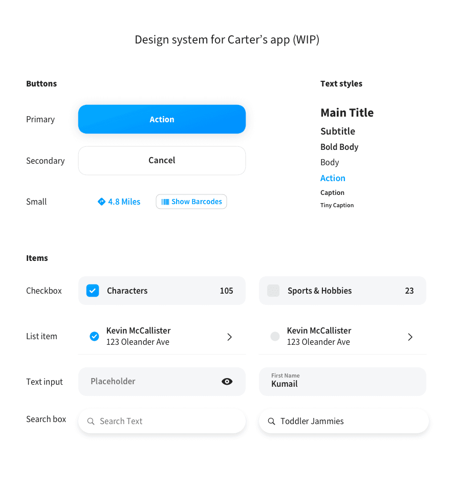
The design system covered the essentials but more importantly was already in production in code.
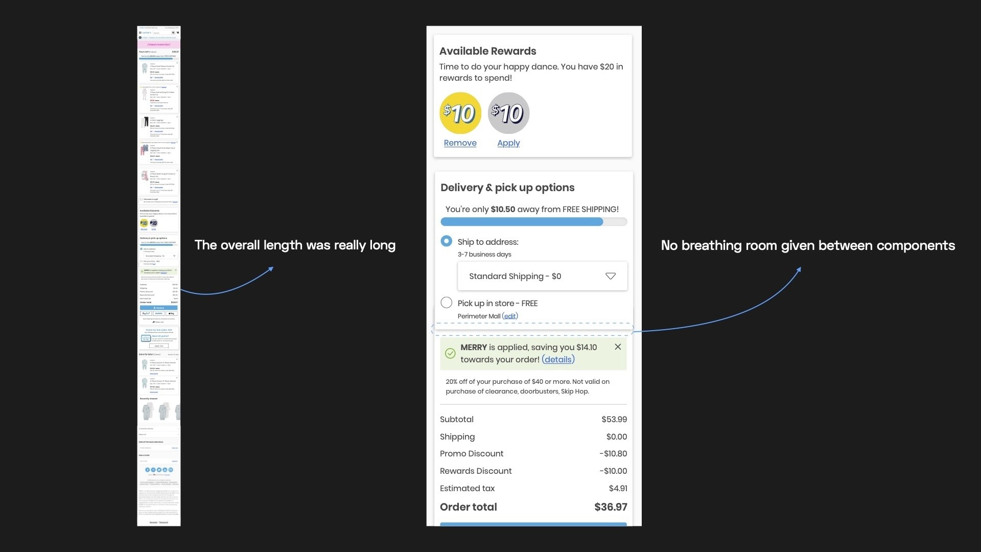
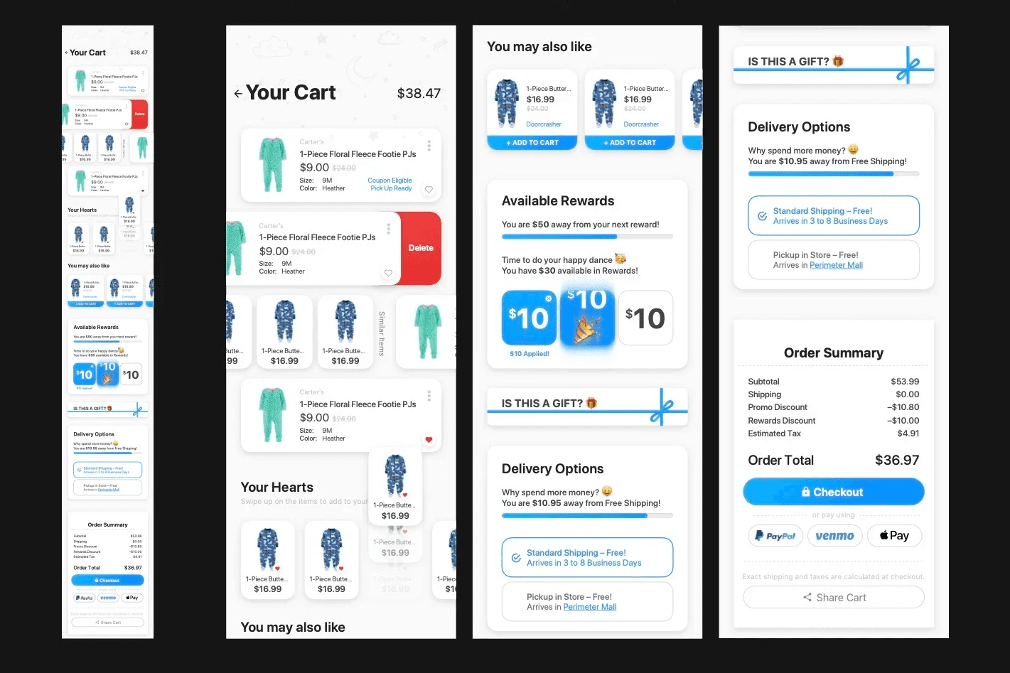
Second version of Cart with the design system applied
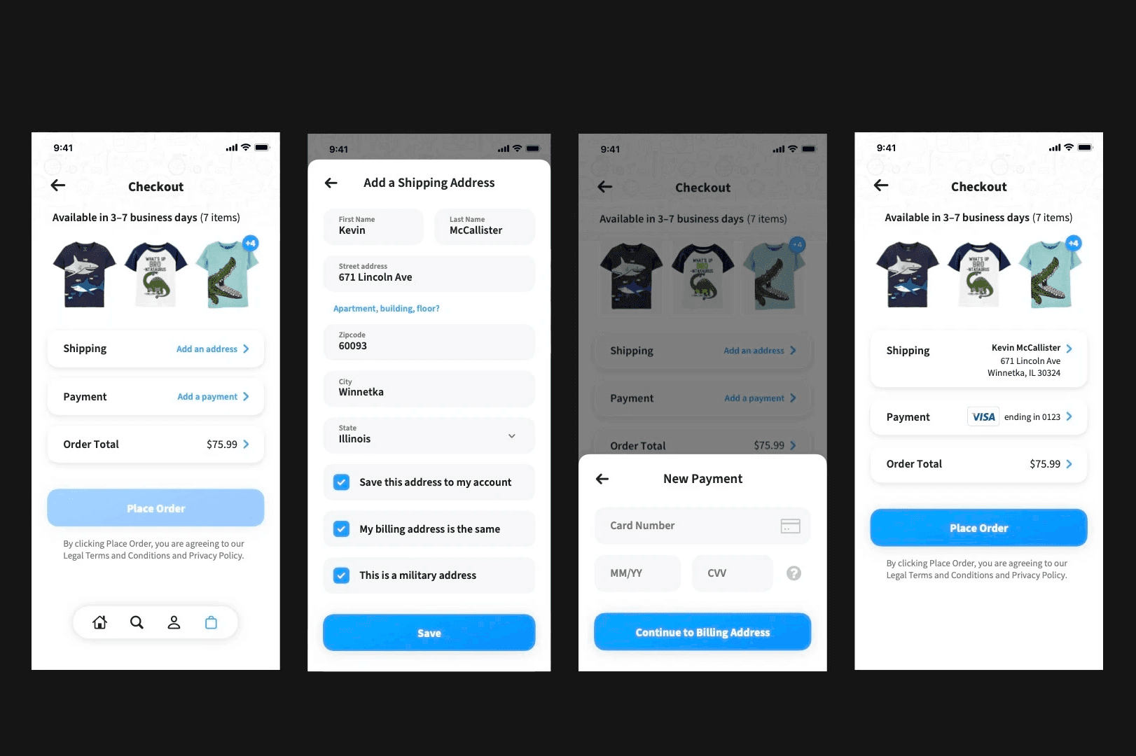
Checkout after the design system had been applied
Solution
We had deemed the above design apt for a quick MVP launch, and it took the engineering team a couple of months to put this in code. Once ready, we had actual customers start use our cart and checkout and give us feedback:
Learnings from analytics and user feedback
Customers appreciated the reduced information and the use of the pop-up drawer paradigm.
Customers built their carts over several days and didn't check out immediately, indicating a need for an even easier checkout process.
It was suggested to simplify the app even more.
Bearing this in mind, I developed the final solution, which ultimately made it into the production app.
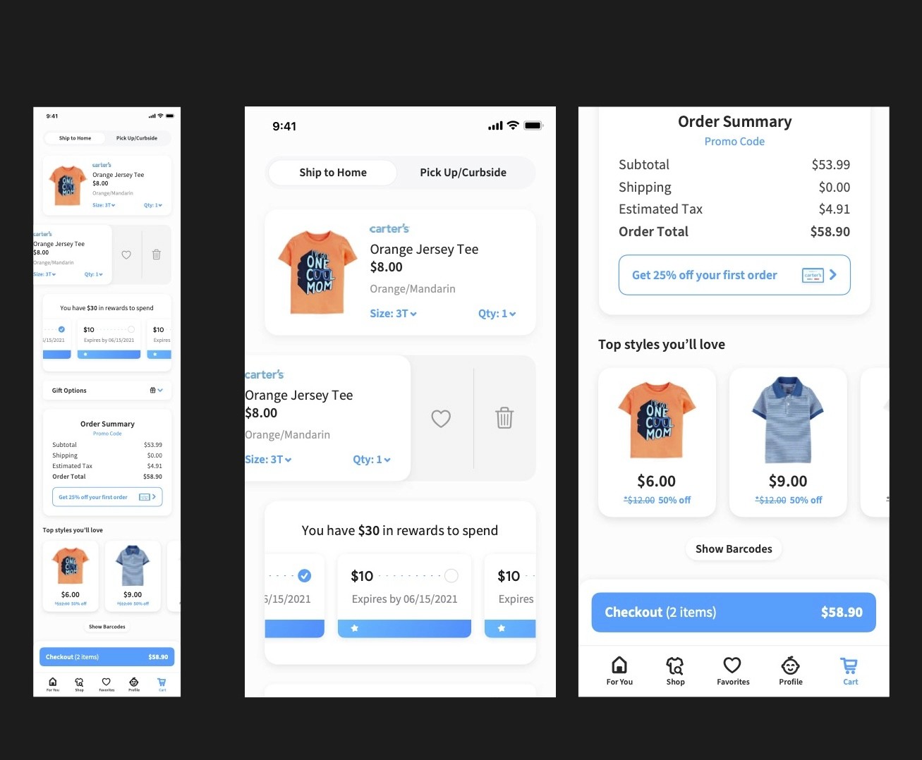
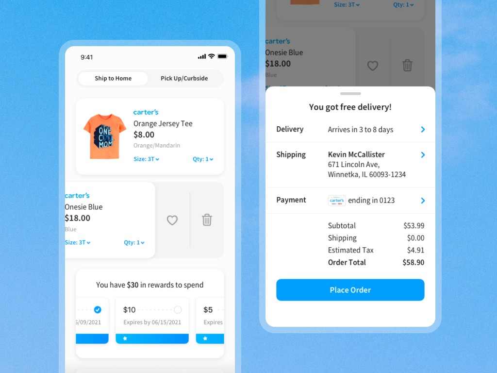
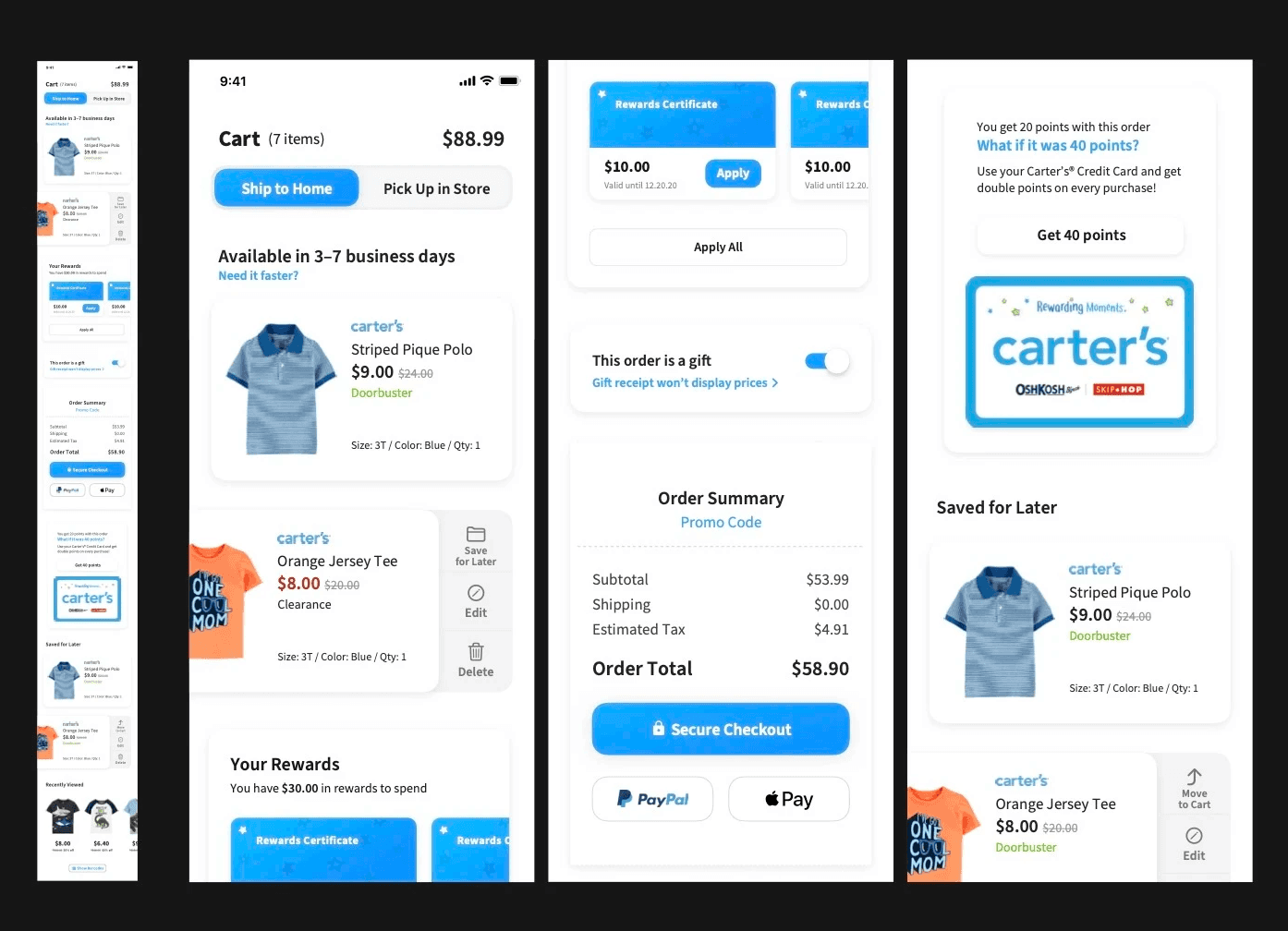
Final Cart I had designed, much shorter in length and a sticky checkout button at the bottom
Final checkout - Becomes even simpler by removing the screen and incorporating all of it using the drawer paradigm
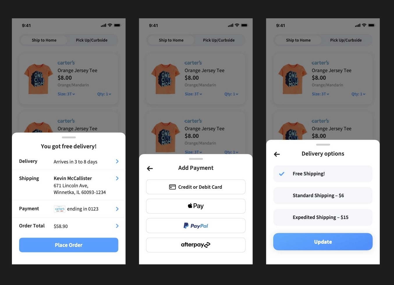
Prototype walkthrough of the final cart+checkout experience that I had worked on
Impact and Learnings
The final result was well appreciated from a design standpoint where we made the process of checking out much simpler. Positive feedback from our customers highlighted the effectiveness of the new design, which contributed to a more enjoyable shopping experience.
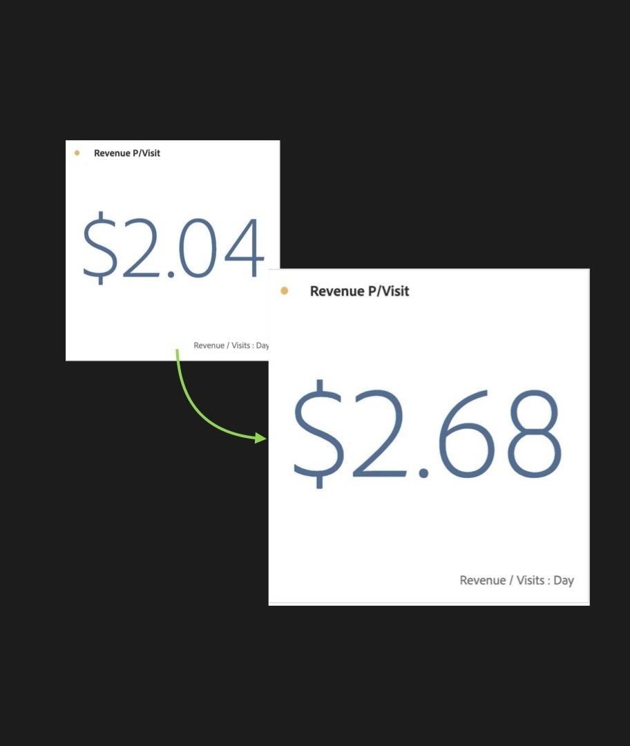
The impact of this was such that we found our revenue/visit stat increase owing to the re-design.
The success of this redesign not only improved Carter's app performance but also helped reinforce my belief in the importance of thoughtful design to help drive business results.