
Overview
Copilot is the first foray for Microsoft into the world of AI. It had been long running as a tented project before it was released to the public on Feb 2023. During beta release, we found that shopping related queries were one of the most popular use cases.
I was part of the shopping design team at the time, was chosen to lead this vertical. The following case study aimed to explore how shopping recommendations and large data sets could be effectively integrated within an AI-powered chat.
Role
I was the sole designer working on this vertical. My partners included a product manager and a team of three engineers. I also corresponded with the design systems team who consulted on basic element styles like color, type ramp etc. Some of what I did:
Vision and strategy
Executive pitch and presentation
End to end product design
Motion design
Problem
Chat isn't ideal for shopping
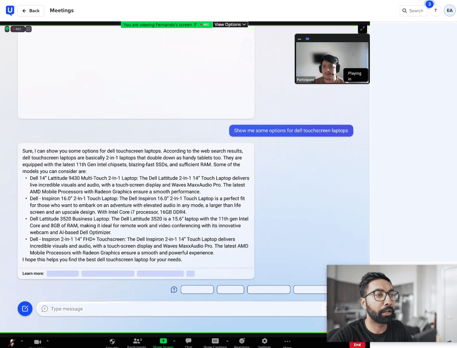
For shopping queries, we found that users often received long paragraphs of text, which, while informative, lacked crucial elements like images, pricing, and metadata, making it difficult to lead to a buying decision—it didn't give a sense of a shoppable product.
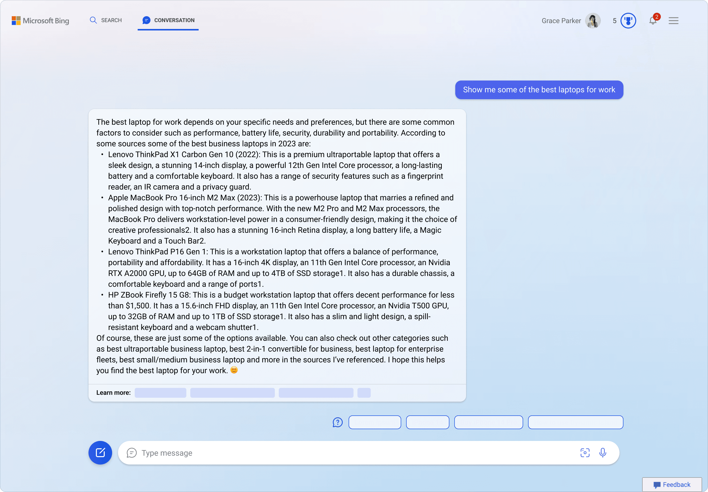
Initial responses for shopping prompts were lengthy, lacked visual aids and metadata.
We had some preliminary research that was done as part of other Microsoft Shopping products and we had some insights about our customers' preferences:
Customers loved to compare products
They enjoyed examining the various attributes of an item and comparing with others to make an informed decision.
Tell me which products are the best
They wouldn't object to being informed about the superior option, provided the advantages were explained clearly
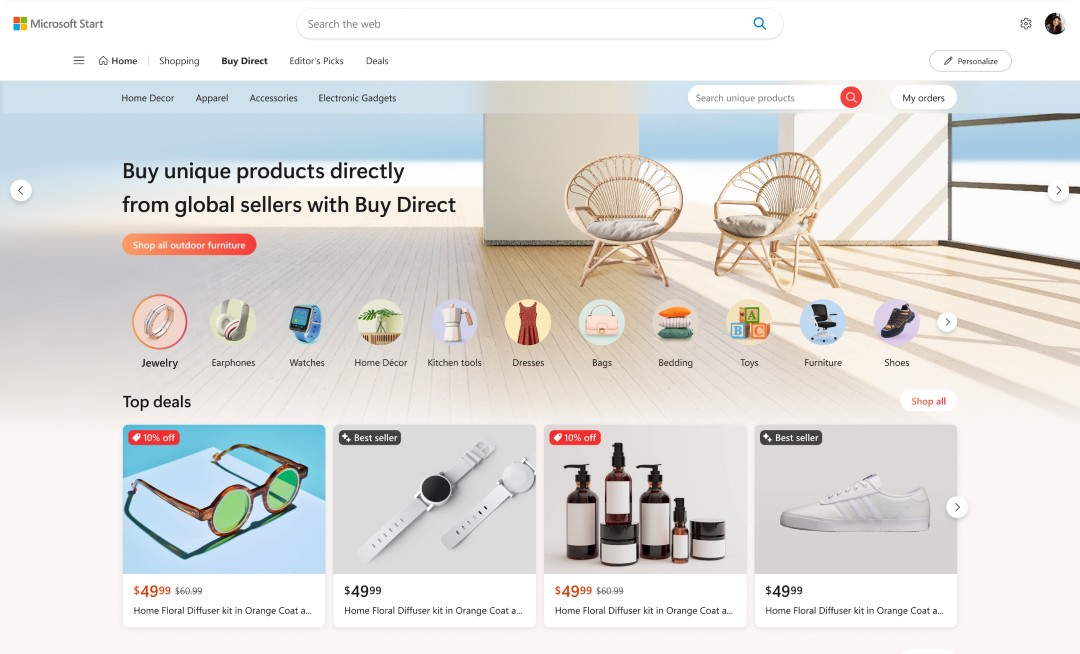
Microsoft Start shopping was a product that we used for research
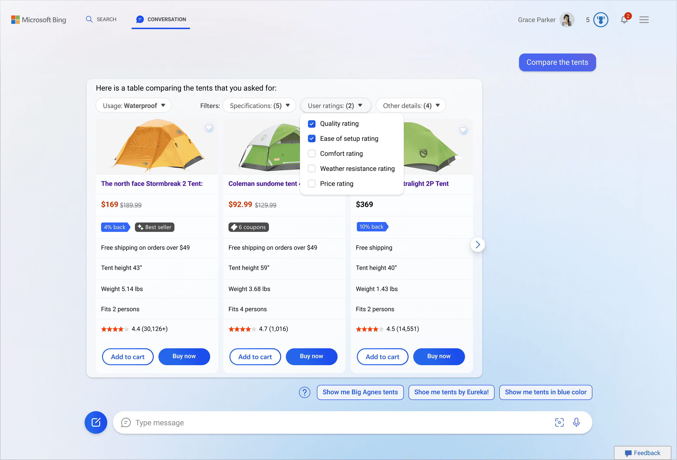
Displaying large data sets
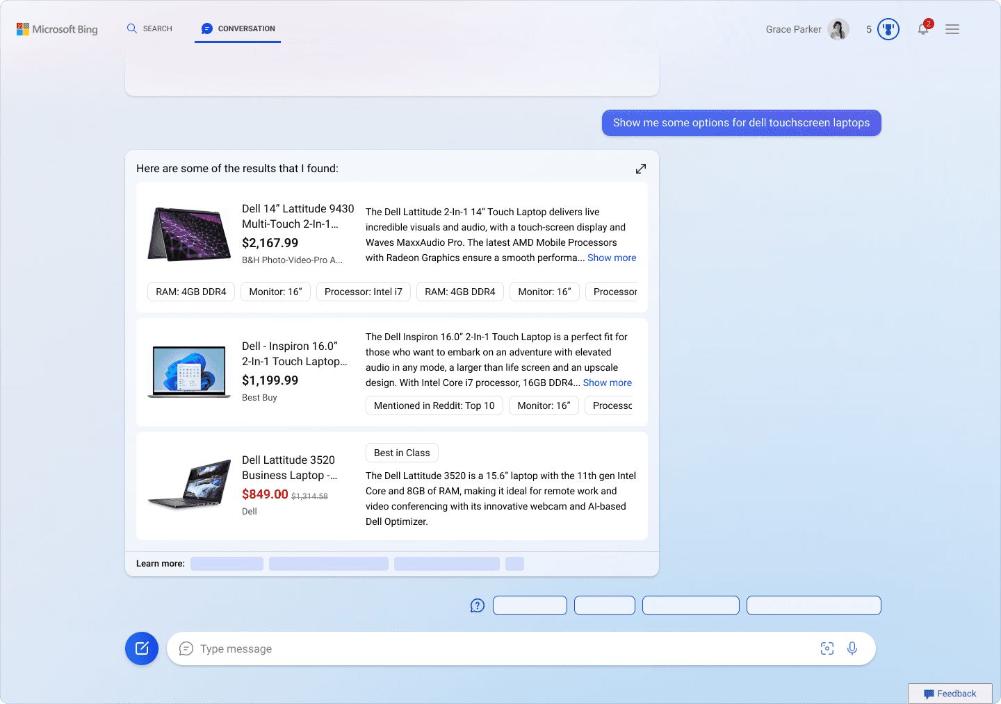
Copilot would be the first time that GPT goodness was being grounded in real time search data. This generated an overwhelming number of data points but restricted to the limited space of the chat interface. During beta pre-launch, our customers indicated that a table format for such longer sets of data is preferred.
Our engineering team had a head start in trying to figure how to incorporate images and displaying this table but were doing so without any design support. We also had executive feedback to incorporate newer functionalities like filter/sort, reviews etc.
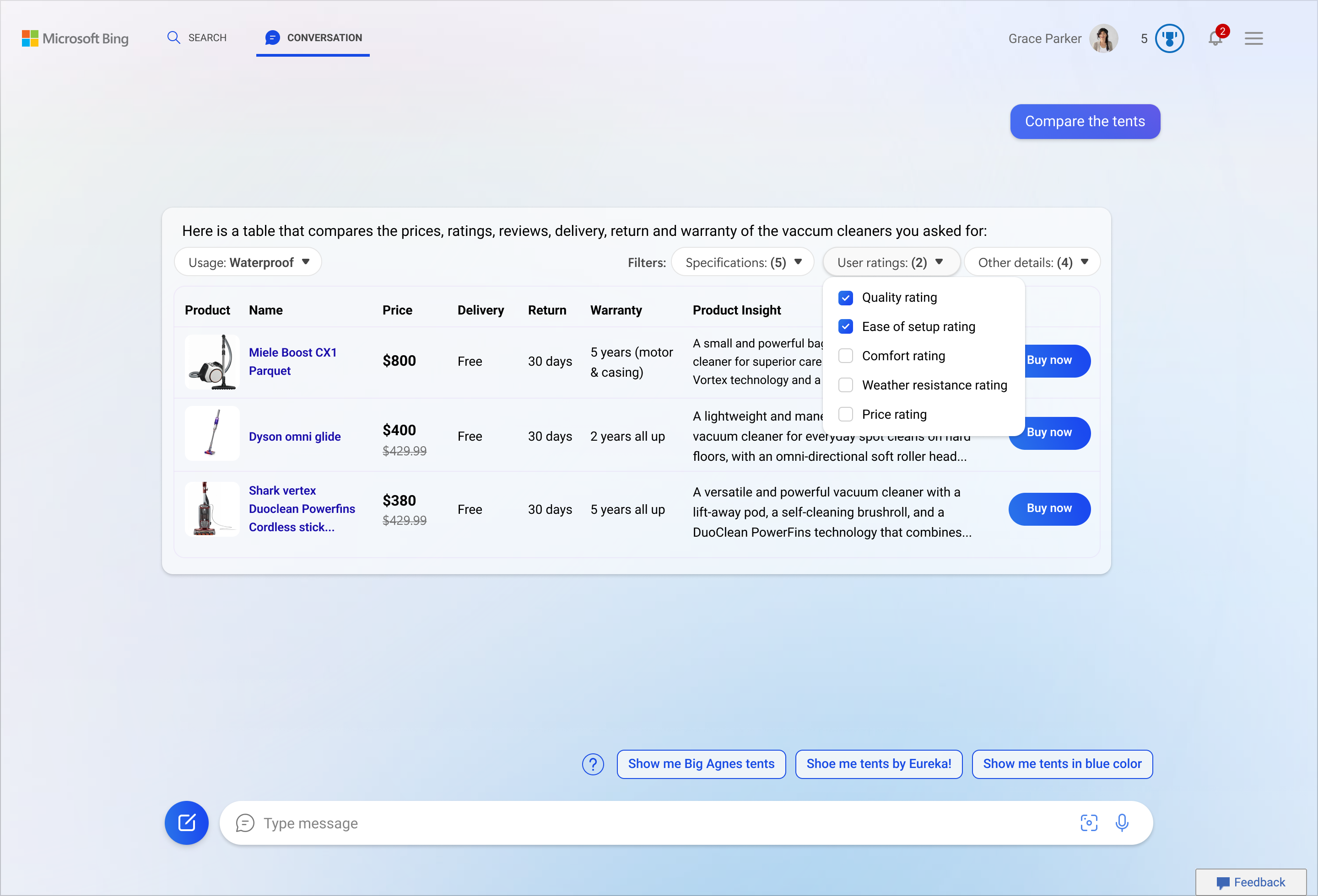
Early attempts made by the engineering team with no design support
Bearing the above in mind, the goal of this project was to:
To design a shopping experience that helps customers find and decide on products effortlessly.
To present large, complex data sets in a way that's easy for customers to digest.
Solution
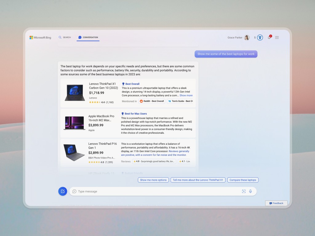
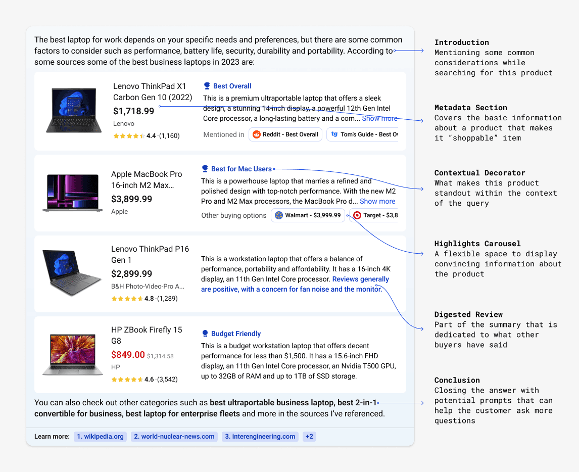
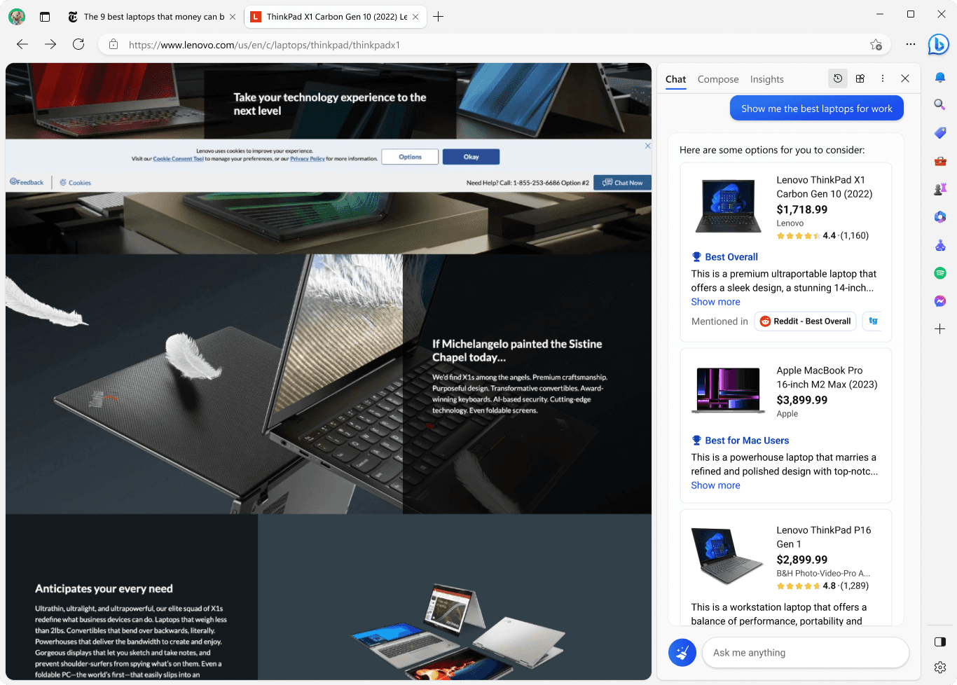
A well rounded, shopping answer
The final design features a layout that accommodated varying amounts of product information in a horizontal format to clearly display images, metadata, and GPT summaries.
Throughout the process, we learnt about the capabilities of GPT, one of the ideas that I added as part of the final solution was a digested review— a summary of all the publicly available reviews.
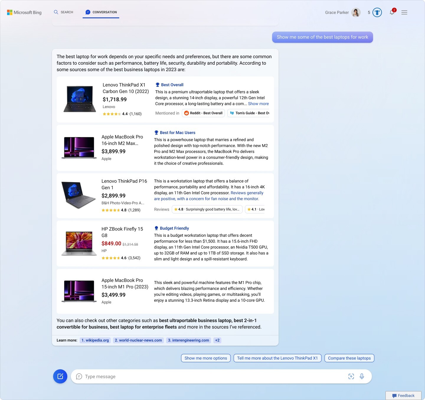
Final Solution - A short intro and conclusion helps tie the natural response of the assistant together.
Details of the final answer
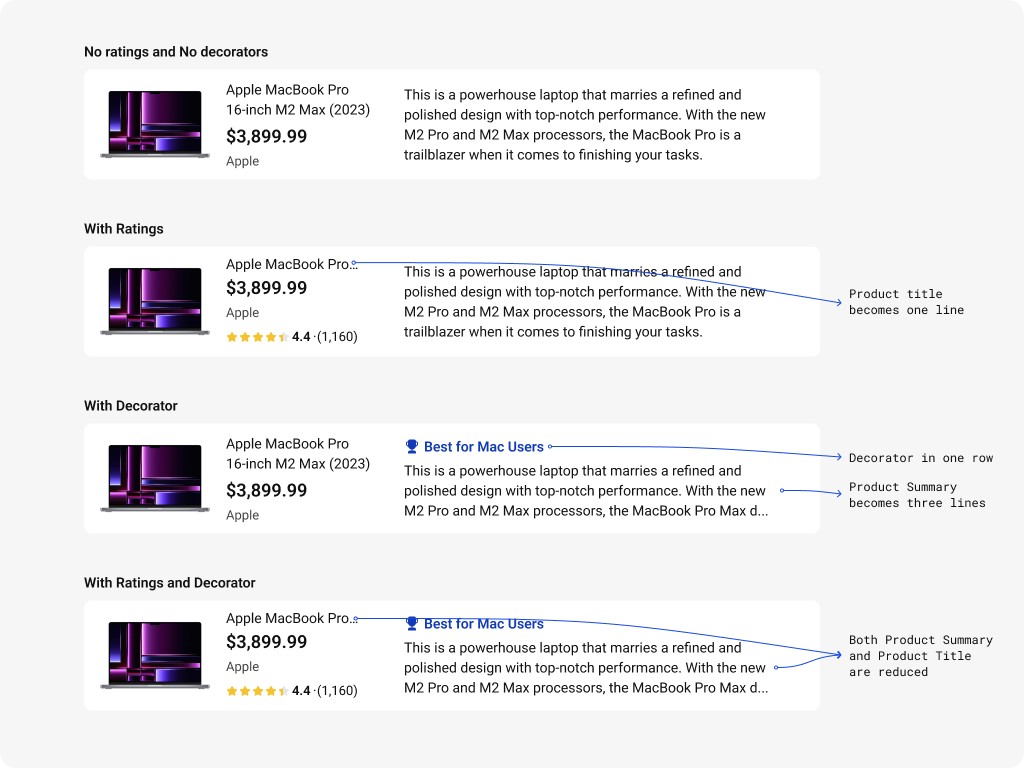
Horizontal Product tile variants
More to what meets the eye
Through user testing we consistently found that progressive disclosure of information worked best to handle larger data sets. I utilized an overlay to display further details such as the comparison table and even a product detail page.
Comparison table and detailed attributes as part of an overlay
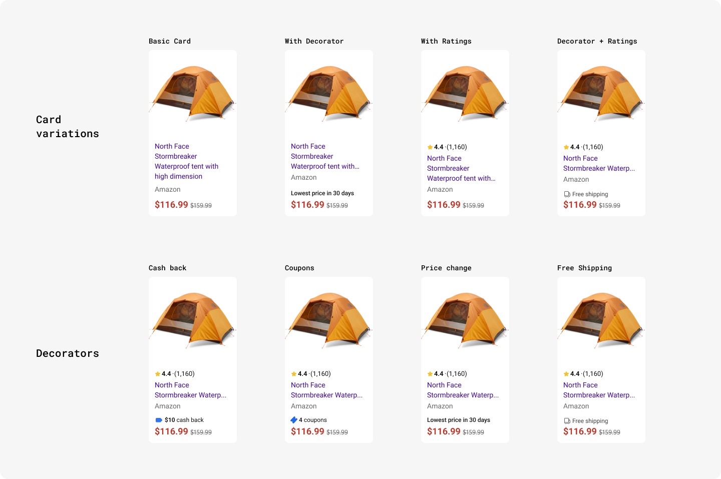
Variations of the product cards for the table
Clicking on the product tiles leads you to the PDP
The end to end shopping journey
Adapted for different formats
The design had to be adapted for a narrower format, for mobile and the Edge web browser. I decided to focus on the image and metadata which gives a sense of the product, truncating the summary with the ability to see more if necessary.
Clicking on any product opens the respective web page on the left
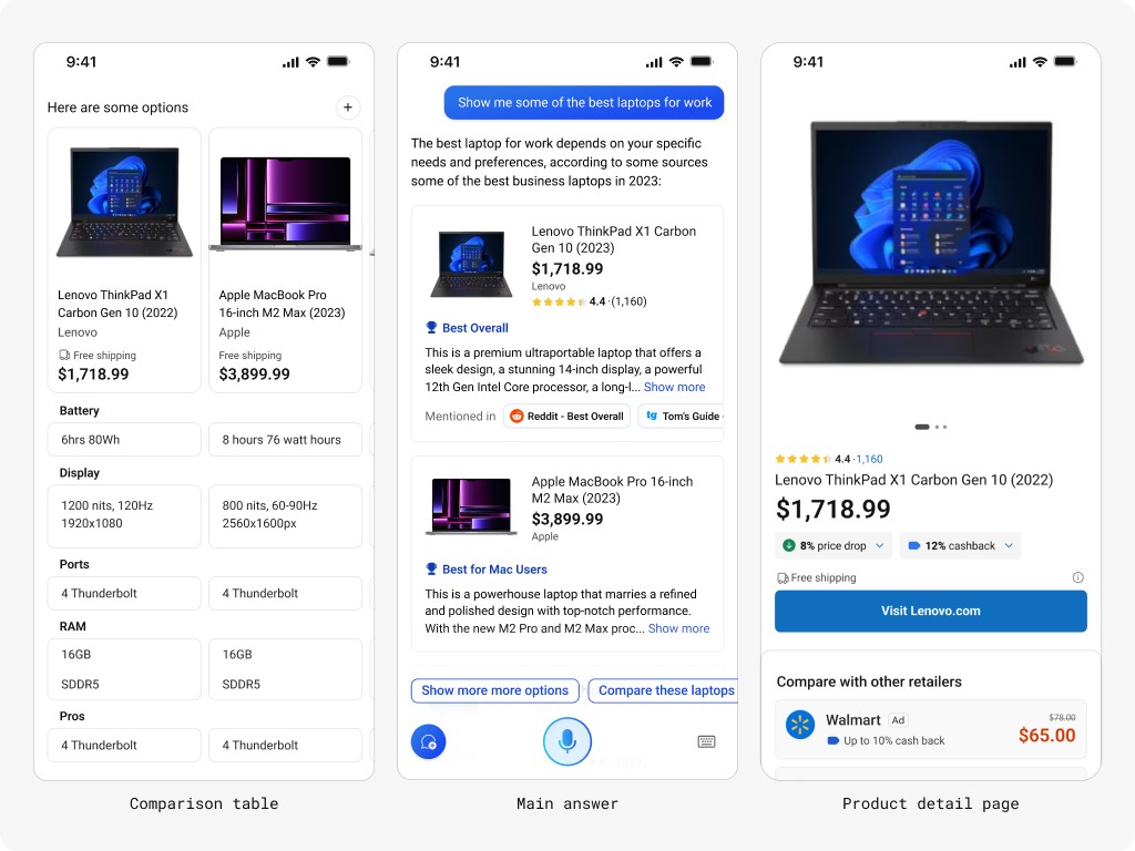
For the mobile version, going with a product carousel made best sense
Process
Initial exploration
To begin I used the engineering teams attempts to base my explorations. I began by going through existing research for Cortana the virtual assistant that also utilized a chat-like interfaces. I found an insight that was helpful:
Insight: Less is more, let the customer decide.
Most customers do want to be overwhelmed with information up front and would much rather choose how much information visible to them with explicit inputs.
My first idea involved exploring through differing amounts of data using explicit actions to view them
I developed multiple layouts of information, some made sense, some absolutely did not
Utilizing an L2/full screen takeover in order to showcase a comparison table or a PDP
Feedback and user survey
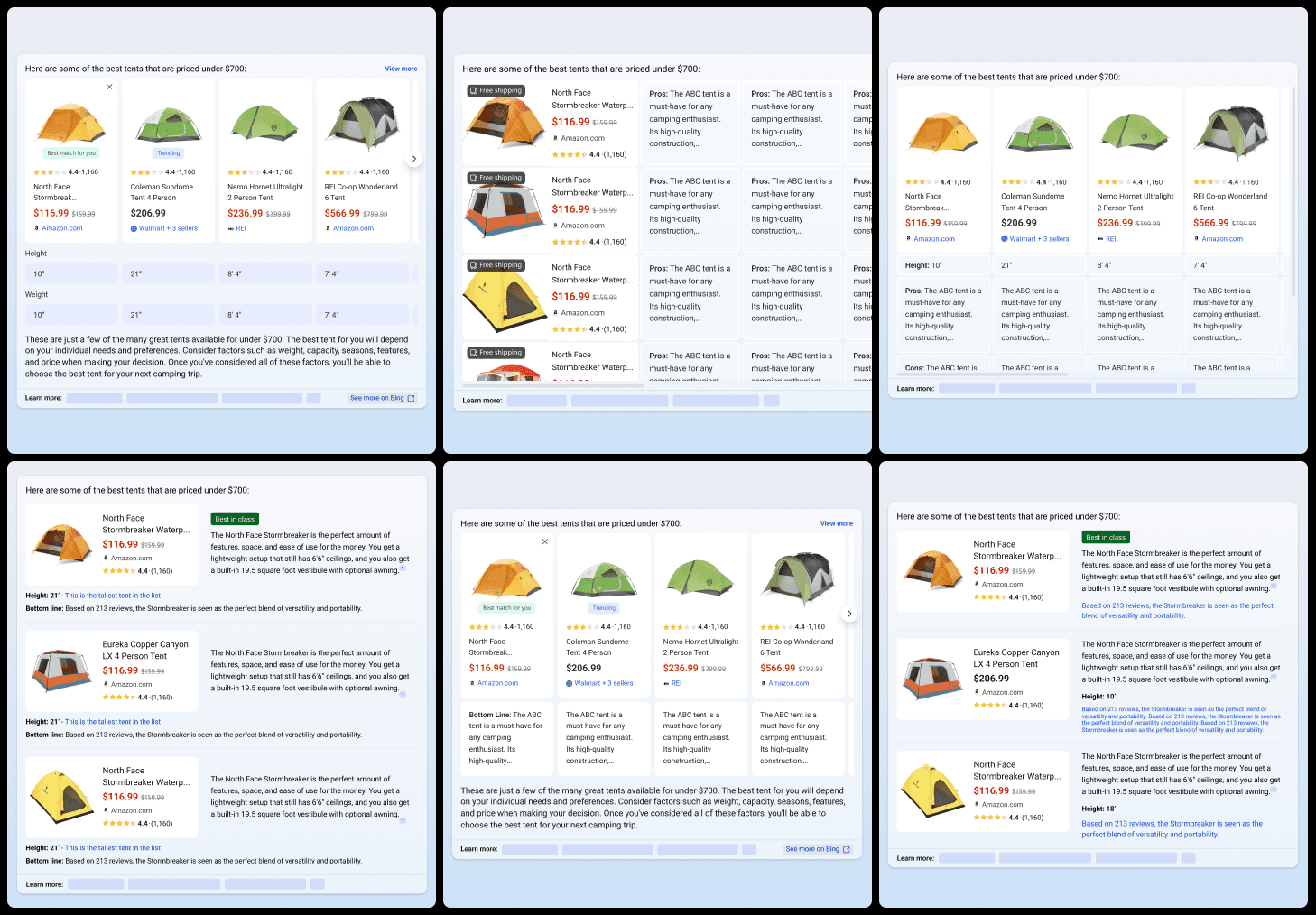
After presenting these initial ideas and going through an initial review with my stakeholders, I had a good idea of which options had potential. I decided to narrow down to four options and conduct a user survey using our internal tool.
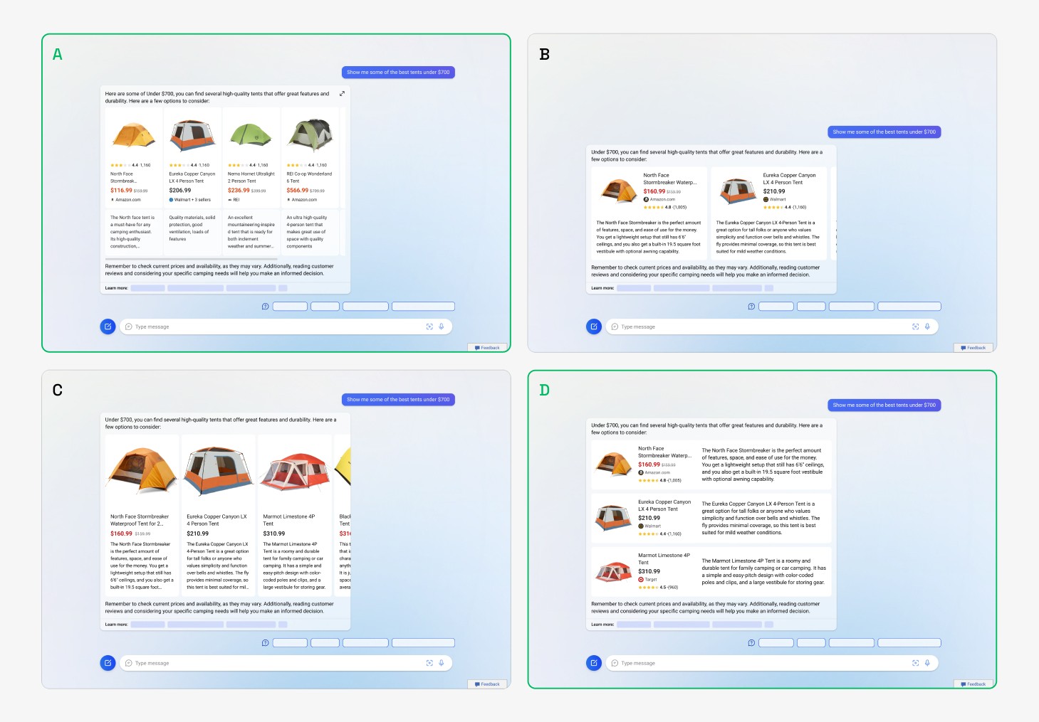
Option A and C look into a vertical layout of the image and information whereas B and D look at a horizontal layout, the nuances between the options occur in the size of the image and subtle changes in metadata
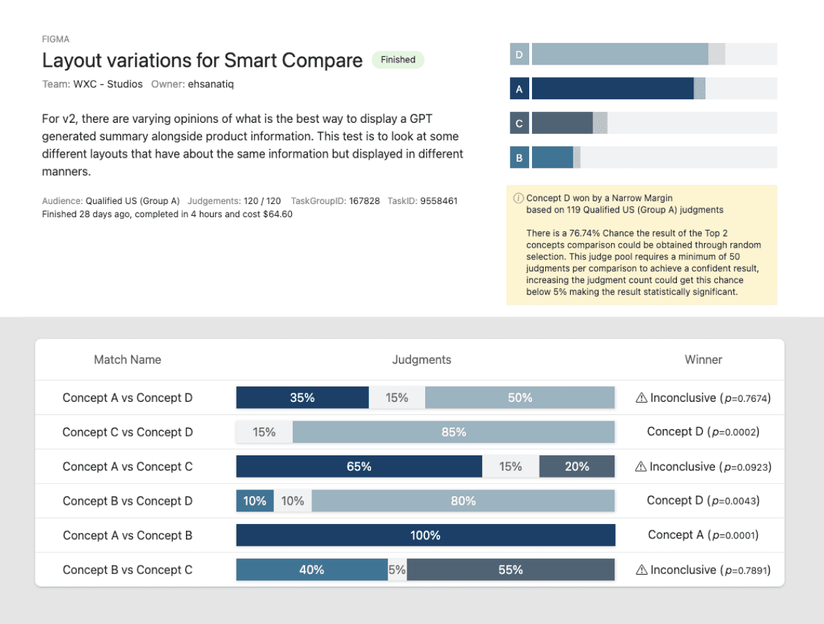
Result Screenshots - Concept A and D (outlined in green) from the above screenshot were the most preferred
Qualitative study
The results from the survey were encouraging. Just to be sure I wanted to run a qualitative user test so that I can be double sure and have some additional user insights. I also included the full text answer that we were trying to address.
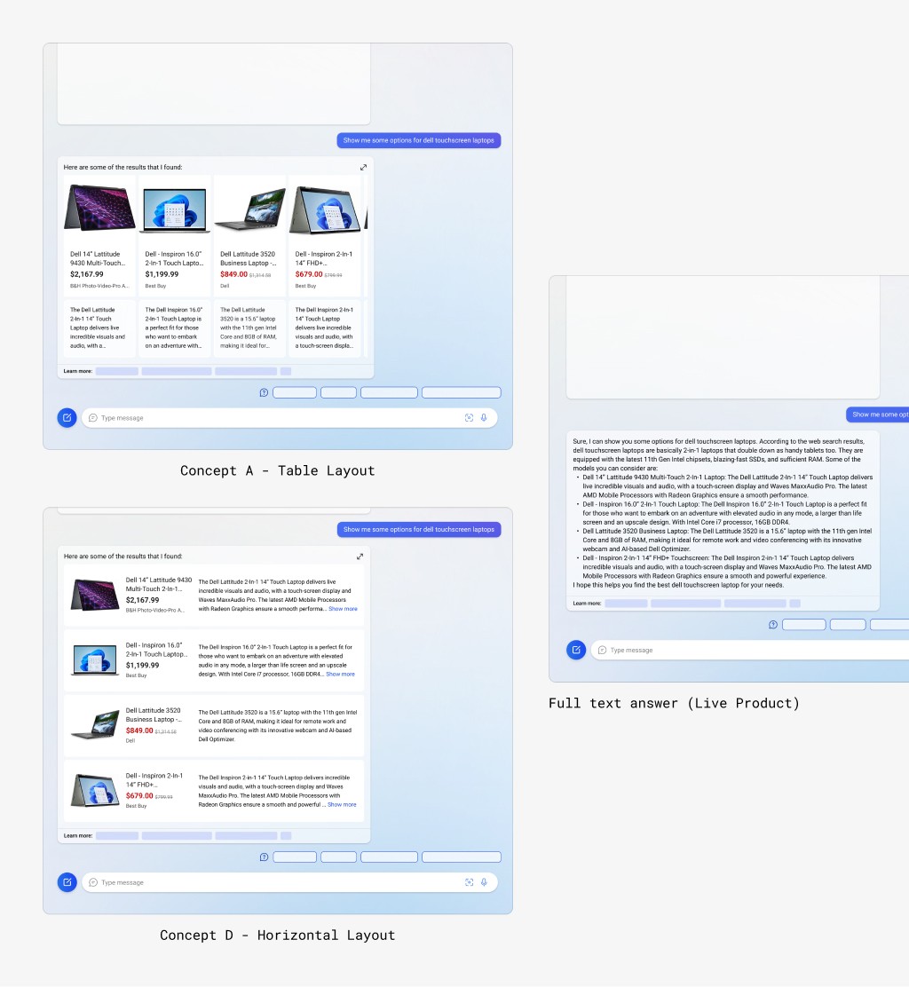
Three concepts with the same information that were used to validate the internal feedback tool
Results from the qualitative study
Most participants (7 out of 10) had a clear preference for Concept D (Horizontal Layout) One of the reasons that was mentioned was that information in rows easier to read as that's the natural manner of how our eyes go about reading a sentence.
Male participant - 30
“I think it looks simple and kind of easy to go through the information. It would definitely help go through the information, kind of more distinct. I don't kind of feel that another way that it can be put or the information can be arranged.”
Female participant - 35
“I don't need to search by myself separately. I can get those details in that place when I click on it so I feel like that would be sufficient. I’m able to get more details and all those details in that page for me to make a purchase."
Qualitative Research - I ended up running the entire study as we didn't have any resources for UXR
Refinement
Now that it was validated that horizontally laid out concept was the most preferred, I started fine tuning that direction. At this stage, I was exploring newer ideas such as adding attributes in a row below, incorporating a summarized review and more.
Adding highlights: Trying out different pieces of information such as attributes, accolades in the form of a pill
Impact and learnings
Upon launch, Copilot attracted ~5M+ daily active users, demonstrating its immediate popularity and relevance. Shopping queries had a contributing factor to the same.
Working on the this project helped me understand the complexities of integrating design with AI-generated content in the e-commerce space. It was a high-stakes, fast-paced project that challenged me to balance stakeholder needs and deliver a design but all in all it's a time I was excited